Project Basta
Desktop Diagnostic Report: Alignment Page
Role
User Interaction Lead
Project Breakdown
Project Basta wants to improve the user experience on their diagnostic report tool. The team is moving toward creating a space-themed experience that guides job seekers through the job searching process.
Tools Used


Mockup
Figma

Introduction
In this project, my first layer of understanding was to lay out what the organization needed. The project began by outlining the most MVP (Minimum viable product). This was a crucial step in starting the design process due to this organization's UX maturity level. On the six levels of the UX maturity scale, I would rank Project Basta somewhere between levels 2-3.
The Project Brief Summary
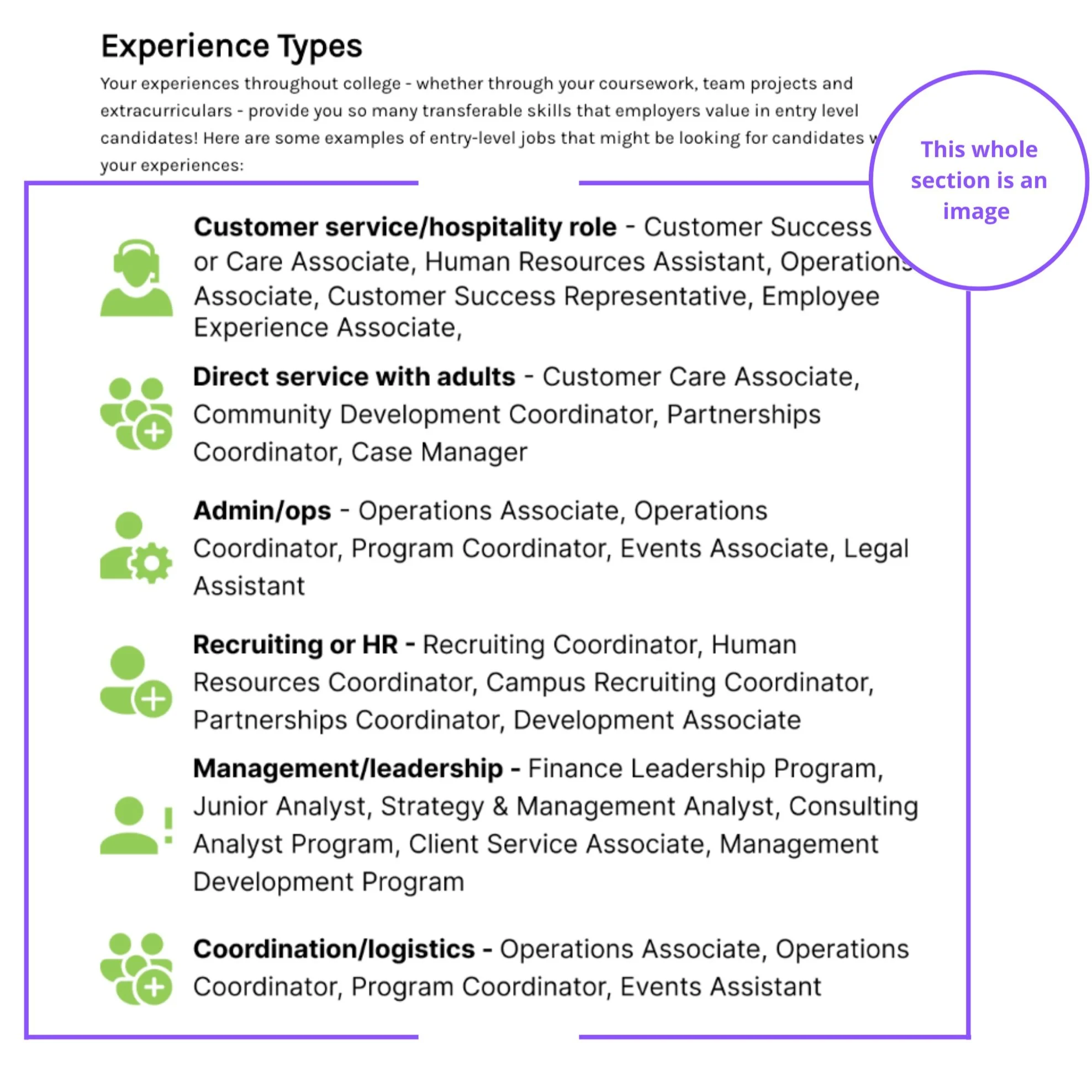
Learning Objectives for Report:
Students will be able to identify their milestones.
Students will be able to locate one of their Alignment factors
Students will be able to explain how their Alignment factors play a role in their career choices.
Brand considerations:
The report will now be called a "Seeker Dashboard."
Integrate space themes into the content and design
As part of this process, they had internal members of the organization give feedback on the existing experience. The two key takeaways from that feedback were
The report was Too text heavy
And the page was lacking in visual queues

Heuristic Evaluation
While looking at this page, I utilized my experience as a designer to evaluate potential pain points.
Only using some of the space.
The current report is underutilizing the space on the page, which makes it feel long and wordy. This design choice is hurting the page's readability; when creating an information-dense page, it's essential to consider that users want to be able to read your content and absorb it easily.
Readable text affects how users process information. This page aims to get users to locate, identify, and understand factors that affect their career choices. The page's poor readability scares readers away from the content, putting a barrier between the user and those key objectives.
Some user-specific data/text are images without alt-text.
While clicking through the report, the user-specific information is an image on the page. When going through the report clusters of data, On the front end, it looked like text, but on the back end, it is an image placed on the page. Also, on the back end, these images don't have the alt="Image Description" line of code to define what they are.
The Web Content Accessibility Guidelines (WCAG) recommends avoiding using images of text if you expect the text to be read by the user unless it's necessary, such as in a logo or brand name, in which case the alt text should be the same as the text in the image.
These images limit the page's Accessibility. What if a user wanted to translate the page because English is their second or third language? What if the user is part of the 250 Million people that need screen readers to access the internet? The gaps in the data would block users with disabilities from getting the insights they need during this career search.
User Stories
User stories are a powerful tool used in Agile development to capture the functional requirements of a project. In our case studies, we utilize user stories to illustrate the real-world needs and goals of our clients and how our solutions have effectively addressed those needs. Each user story presents a specific scenario, outlining the motivations and goals of the user and how our solution has provided them with a seamless and fulfilling experience. By showcasing these stories, we offer a deep dive into the impact and value our solutions have brought to real-world users.

Sketches
UI sketches are early-stage visual representations of design ideas they are used to explore and communicate design concepts quickly and effectively. In this project, I included UI sketches to showcase the evolution of the design process and to demonstrate the iterative approach to design. The sketches highlight the various design options and ideas considered, allowing the audience to see how the final solution was developed .


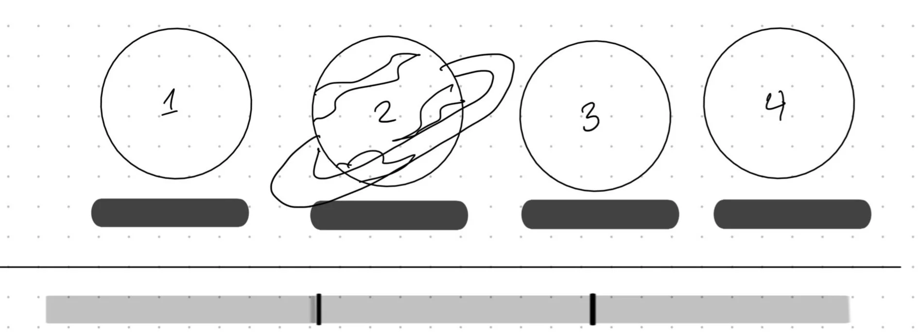
Feature: Repurposing the Navigation Bar
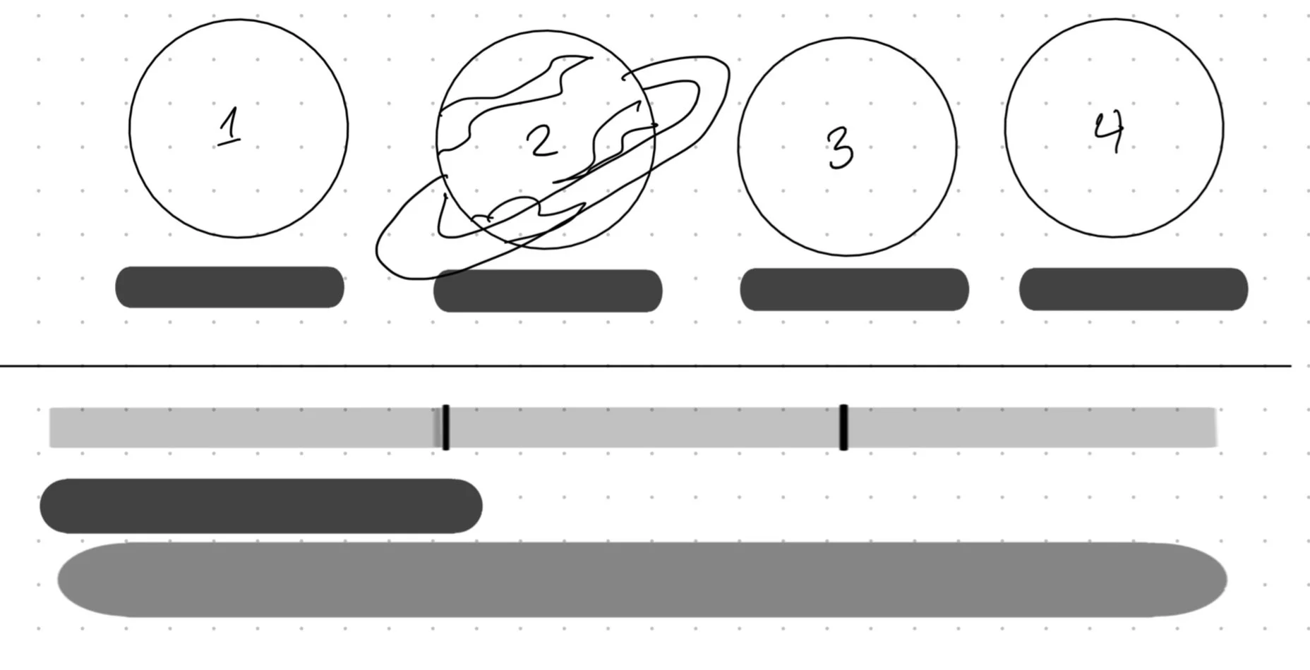
While sketching, one way I wanted to incorporate the space theme was by utilizing the report middle navigation. I wanted to take advantage of the existing design by turning the circles into planets. Indicating that each stage was a different stop on the job-searching journey.
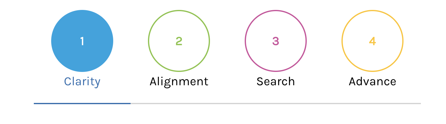
Original
Sketch

Feature: Radar Graph
Instead of using the existing layout I wanted to shorten the section and make it more personalized and readable. I had to take into consideration how the chart values are calculated by the personal assessment quiz that Basta fellows fill out to get this report. I realized that the data is ranked based on a numerical value generated from the answers. I thought that the same goal could be better achieved with a radar graph. It’s s personalized and can be understood with fairly little effort and it quickly draws focus to the values that are most important to the user.
Sketch
Original
Feature: Sub-navigation Bar
While talking to users I noticed that some users referred back to different sections during class time. They would have to scroll through all the content to get to specific sections to complete different exercises. I wanted to add sub-navigation to help fellows quickly find the sections they need when they need them.
Wireframe
I began to work on creating the wireframes based on the sketches using Figma. Here's what I came up with. After prototyping the wireframe.
High-fidelity Design Version one
This was the first iteration of the new Basta Diagnostic report.