Bank of America
Mobile Application Design
Role
User Interaction Lead
Project Breakdown
Bank of America wants to help its community by teaching how to budget, instill healthy spending habits, save money, track student loans and plant a seed for a financial future.
Timeline
Two week design sprint
Tools Used
Mockup
Google Suite
Figma
Asana
Full Project at a Glance
Bank of America is looking to explore the area of financial literacy for college students. During the research phase, we identified two user personas.
Problem: We concluded that users need an easy way to learn about and manage their finances to understand and meet their financial goals.
Process: Then the ideation process began with “how we might statement” exercises that influenced the development of the first two user flows. After those flows were established, we developed sketches and wireframes that we tested on five users before we entered the high-fi design mock-up phase. After applying user insights and iterating on the wireframes, the team got to work on designing the high-fidelity mock-up. After finalizing the design, six more user tests were conducted on the high-fidelity mock-up. Users were then asked to complete a product satisfaction survey to calculate the system usability score.
Results: The final product scored 91.25 on the usability scale which is above the average percentile.
Introduction
The financial life of a typical college student is relatively simple, but unfortunately, many students still aren’t equipped to handle money. Bank of America is looking to explore the area of financial literacy for college students. The Bank wants to help its community by teaching how to budget, instill healthy spending habits, save money, track student loans and plant a seed for a financial future.
Project Planning
For this team, project planning is an essential part. Our team, the Figma Fairies ✨🧚♀️divided the lead roles into three parts. Planning lead, Research lead, and my role User Interface Lead. As the UI lead, I was responsible for delegating design tasks, creating an asset library, and maintaining consistency throughout the design process.
Over the years, I have become a “Google Docs Wizard” ✨. My UX Project Tool Kit is one of my favorite ways to stay organized during any UX project. I have developed FREE and easy forms to start any UX project in this kit. The kit includes User Satisfaction Survey, Heuristic Evaluation Sheets, User Testing Tracker, SUS Score Calculator, a Competitive Analysis Sheet, and a UX Project Guide. For this Bootcamp project, the Figma Fairies ✨🧚♀️ decided to use my tool kit. We collaborated to customize the template and used this as our planning system. If you want to see more in-depth, feel free to check it out.
Screener Survey
A Screener Survey with Google Forms was distributed among multiple groups of college students. The purpose was to determine college students' essential 'pain points' concerning finances and budgeting. Working with real-world data is a good starting point to help avoid guesswork and preconceptions the team might already have when thinking of a solution. Learning about the problems of potential users is a great way to be inspired.
32 Participants completed the survey
54.8% of survey respondents reported, "I need help budgeting my money."
96.8% of participants use their bank's app for their banking needs
Heuristic Evaluation
With an understanding of what college-age users seek, we compared the current Bank of America Mobile application experience to current usability standards. As a team, we decided that the application had a case of featuritis, and as a result, building out a new function would only make it worse, so we opted to redesign the current experience.
When compared to other banking apps
The current app does not allow users to easily link external investment accounts.
Users couldn't categorize their transactions and were not provided with integrated financial tips.
The wording for categories and labels is confusing.
For example, for a user to find the budgeting and spending feature, they must click on "dashboard" and "On average, you spend $$$ less than you deposit."
Another example of confusing wording comes on the popup, where the "Go Back" button does not allow the user to return to the previous screen. It simply closes the popup box. And then, some screens do not allow the user to go back or exit.
Original Bank of America Application
Takeaways
Users don't know how to start budgeting
Users need an easy way to learn about their financial concepts
Users need financial planning tools
Users want a way to easily track spending habits
Users primarily use their banking app to check their account balance (which is done frequently)
Users do not want to go out of their way to learn new information
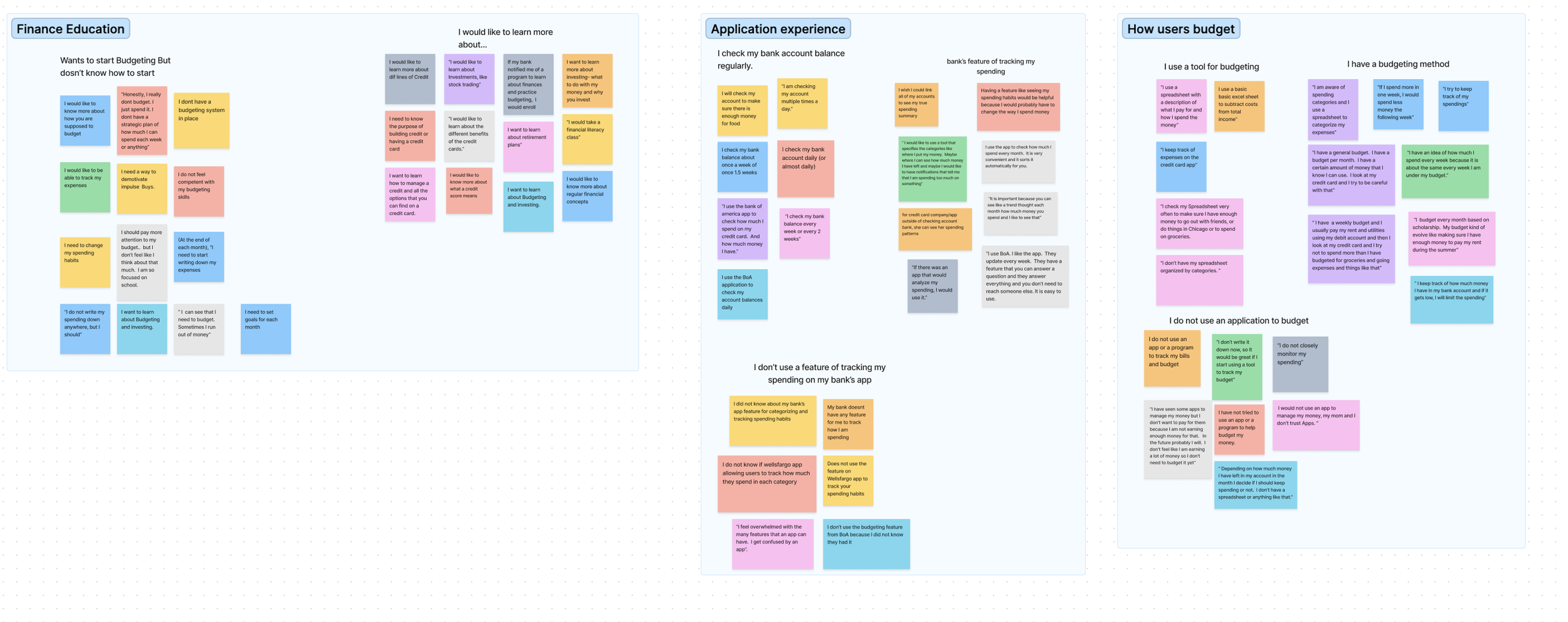
User Interviews & Affinity Mapping
After setting goals for the User Interviews, we began drafting a planning guide for our interviews. After reviewing our notes, we built an infinity map on Figma to identify user insights. In total, we conducted 10 user interviews identified by the screener survey.
Problem Statment
Users need an easy way to learn about and manage their finances so they can understand and meet their financial goals.
User Personas
In order to provide users, like Jackie and Jake, with an easy way to learn about and manage their finances, the redesigned Bank of America app now includes simplified and customized budgeting and savings functions, as well as integrated teaching of financial concepts.
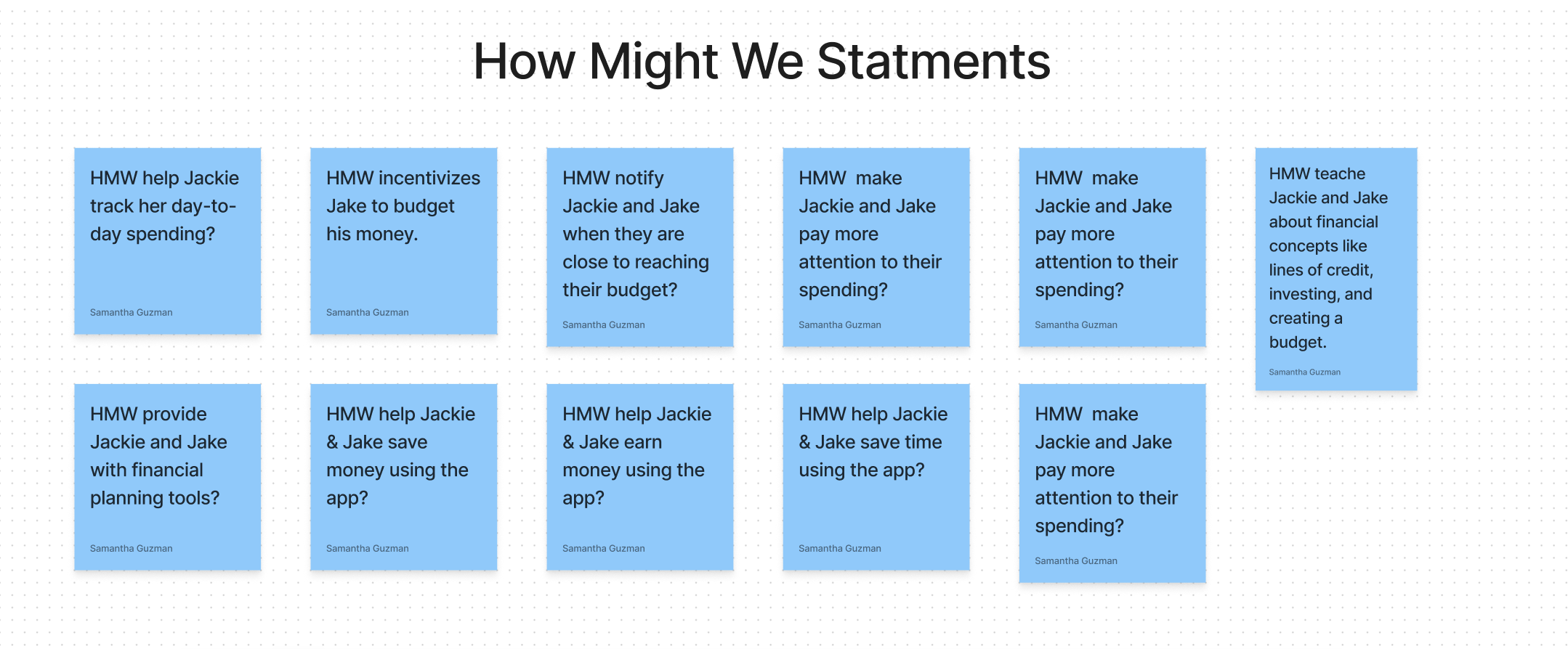
How Might We Statements
"How Might We" (HMW) statements are questions that allow designers to reframe our insights into opportunity areas and innovate on problems found during user research. They are a rewording of the core need uncovered through user research. I have found that it helps teams focus on user needs and problems, rather than just jumping straight to solutions. To begin the ideation process I lead a how might we statement exercise, to begin thinking.
User Flows
We decided to work on Three Flows: Flow One for Jack to be able to categorize his expenses. Flow Two for Jack to link his external investing accounts to the app and Flow Three for Jackie to help her to create a saving goal for her trip to Cancun.
Flow One
Flow Two
Flow Three
Sketches
To begin the product ideation with the rest of the team, I lead the group through a design studio to rapidly generate more innovative solutions and better visualize the complex nuances of the projects. We then began to create sketches the ones shown below were my first iterations. After conferring with the team, we combined sketches and began converging on a solution. Here are my sketches.
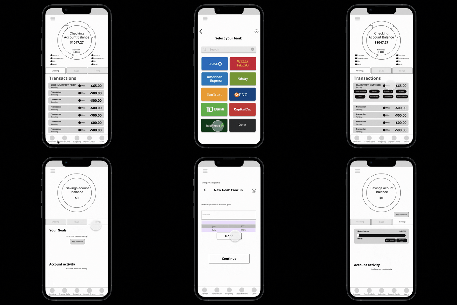
Wireframe
I began to work on creating the wireframes based on the sketches using Figma. Here's what we came up with. After prototyping the wireframe we conducted 5 user tests with our wireframe to validate our solution. After our results, we iterated the screens and moved on to creating our high-fidelity Prototype.
Wireframe Testing Results
Select Date feature for the savings flow wasn't working
Changes when categorizing the Zelle transaction were not noticed
Liked that all accounts were in one place because it lowers the amount of storage he needed on their device
Would not take the initiative to click on “learn” for articles or videos to learn about finances
Some of the users didn’t recognize that there were buttons for categorizing transactions
High-fi #1
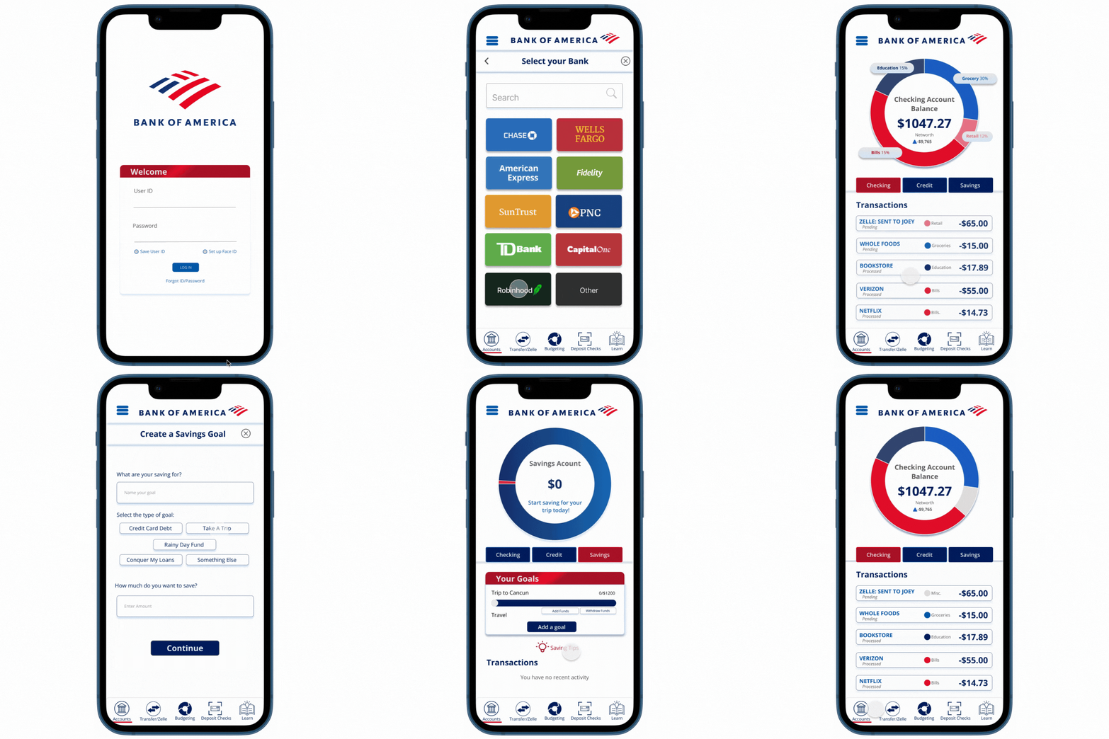
This was the first iteration of the new Bank of America mobile application prototype. In the development of this version, I created a design system to help keep the product consistent.
For this prototype, we conducted 6 User Tests to test the solution. In our satisfaction surveys used to calculate the sus score of the product user scored this product with an average score of 91.25. Users found the system easy to use, but throughout the process, the team noticed some inconsistencies in the prototype while users were trying.
Some call-to-action buttons were too small when users tested the product from their phones.
Some of the elements were not correctly lined up from page to page.
High Fidelity
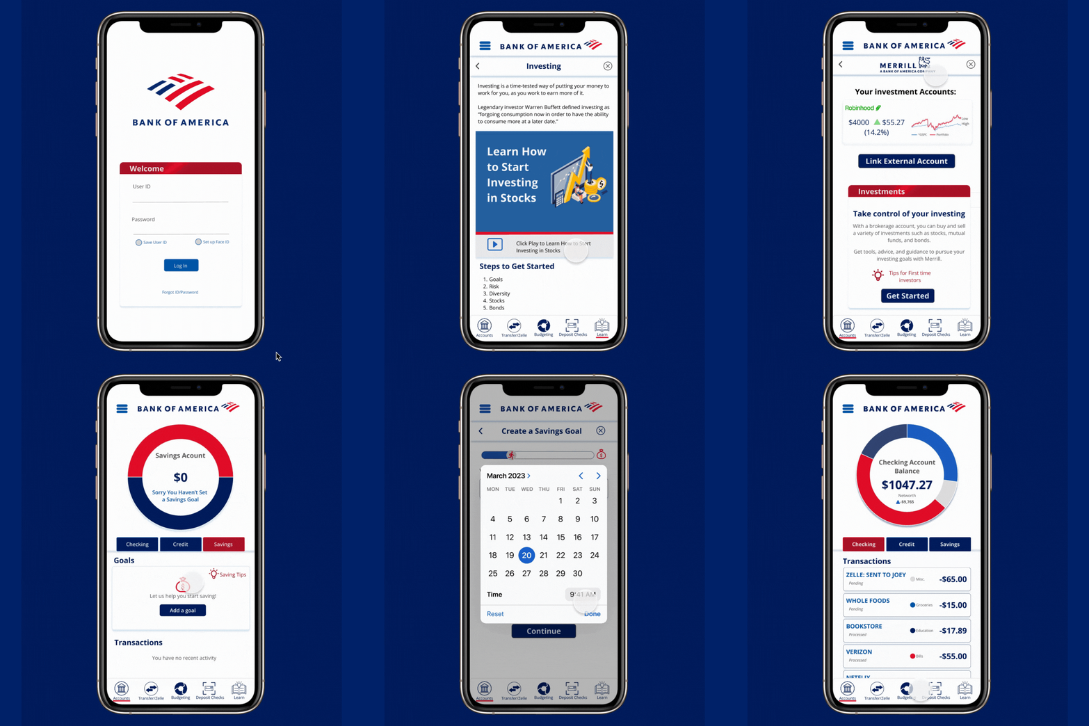
This was the first iteration of the new Bank of America mobile application prototype. I created this on my own to work on the insights gained from the last user test in the first iteration.
Next Steps
There was a two-week timeline for this project. For the next step, I would like to conduct more user testing with this iteration to see if the changes improved the usability score. I would also like to build out more of the screens for the project.
