
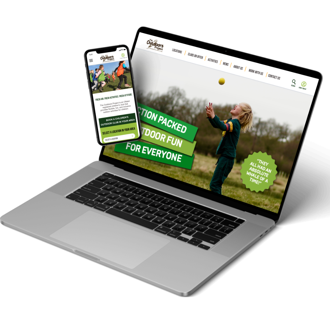
The Outdoors Project
Mobile Website Design (Client Project)
Role
User Interaction Lead
Project Breakdown
The Outdoors Project is a UK franchise that provides parents/caregivers with children of ages 5-11 with activities clubs for kids. The Outdoors Project connected with our team because their goal was to improve the customer journey to reserving a service via their website.
Tools Used


Mockup
Figma
Google Suite
Introduction
The Outdoors Project is a UK franchise that provides parents/caregivers with children of ages 5-11 with activities clubs for kids. The Outdoors Project connected with our team to improve the customer journey to reserving a service via their website.
Role
As the UI lead, I was responsible for delegating design tasks, creating an asset library, and maintaining consistency throughout the design process.
Hotjar Analysis
Once doing an initial audit of the hot jar analytic 75% of your website visitors were new customers, the organization has an incredible window of opportunity for growth.
However, about half of visitors leave after viewing 1 page, strengthening the case for turning over a new leaf by redesigning the site with a more user-friendly approach.
Since 80% of users access the site through their mobile devices, we decided to focus on optimizing that experience during our sprint.
After initial inquiries, we had users from the contextual fill out a user satisfaction survey. Most users were unsatisfied with the process and needed clarification on the existing booking process. On average, the user's responses lead to a genre sus score of 61.91.
Contextual Inquiry and User Satisfaction Survey
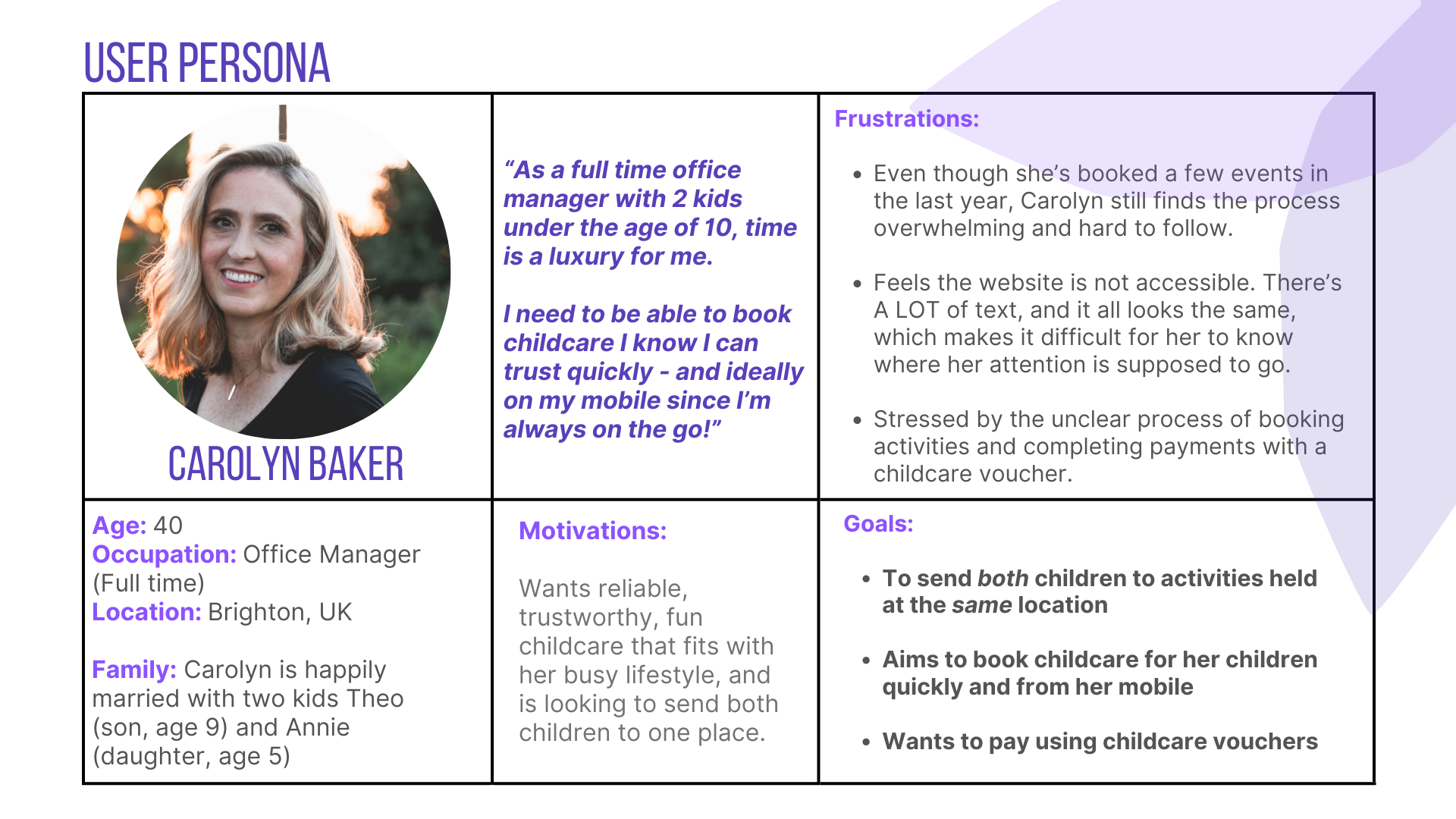
User Persona
We created Carolyn to help us focus on who, specifically, we were designing for. Like most parents of young children, Carolyn feels like there are never enough hours in the day. After recently going back to working in an office full-time instead of from home, that sentiment is even stronger, and Carolyn is looking to sign her children, Theo and Annie, up for more professional childcare. Carolyn has booked six Outdoor Project events for Theo over the past year, but there have been a couple of time-consuming obstacles preventing her from using them more. Mostly, there's the clunky booking process. Especially paying for activities, as Carolyn uses childcare vouchers, which involve a LOT of back and forth between the Outdoors Project website, her email, and communicating with her voucher provider. While she struggles to trust the website, Carolyn wholeheartedly trusts the staff. Now that Annie is old enough to attend their activities, Carolyn’s motivation to book events with The Outdoors Project has increased.
Problem Statment
Carolyn needs a clearer, quicker way to reserve spots for their children in events put on by The Outdoors Project so that they can be confident they have secured childcare and completed their payment.
Impact on the Business
The Outdoors Project needs a consistent and clear onboarding and booking process so that they will be able to provide customers a positive and trustworthy experience.
Users love the programs and staff, but find the website “clunky,” “disorganized,” and “stressful” to use.
Research Key-takeaways
Parents want it to be easier to see events in multiple franchise locations, and not just where their address or child’s school is
Users want the ability to add multiple children to an event via 1 checkout process instead of having to repeat the process for each child AND want it to be easier to see how many slots are left per activity.
They dislike having to leave the site to complete tasks, and would like clearer instructions and communication regarding what stage of the booking process they are in, especially when paying with childcare vouchers.
After completing Heuristic Evaluation, User interviews, Affinity Mapping, Sus score surveys, the team came up with these key insights to Inform the UI design .
Affinity Mapping
"How Might We" (HMW) statements allow designers to reframe our insights into opportunity areas and innovate on problems found during user research. They are a rewording of the core need uncovered through user research. It helps teams focus on user needs and problems rather than just jumping straight to solutions. To begin the ideation process, I lead a "how might we “exercise to start thinking.
Affinity mapping is putting sticky notes with ideas on a wall and grouping them based on their similarities. These groupings can help you extract insights and themes to help you build effectively toward the next steps of designing.
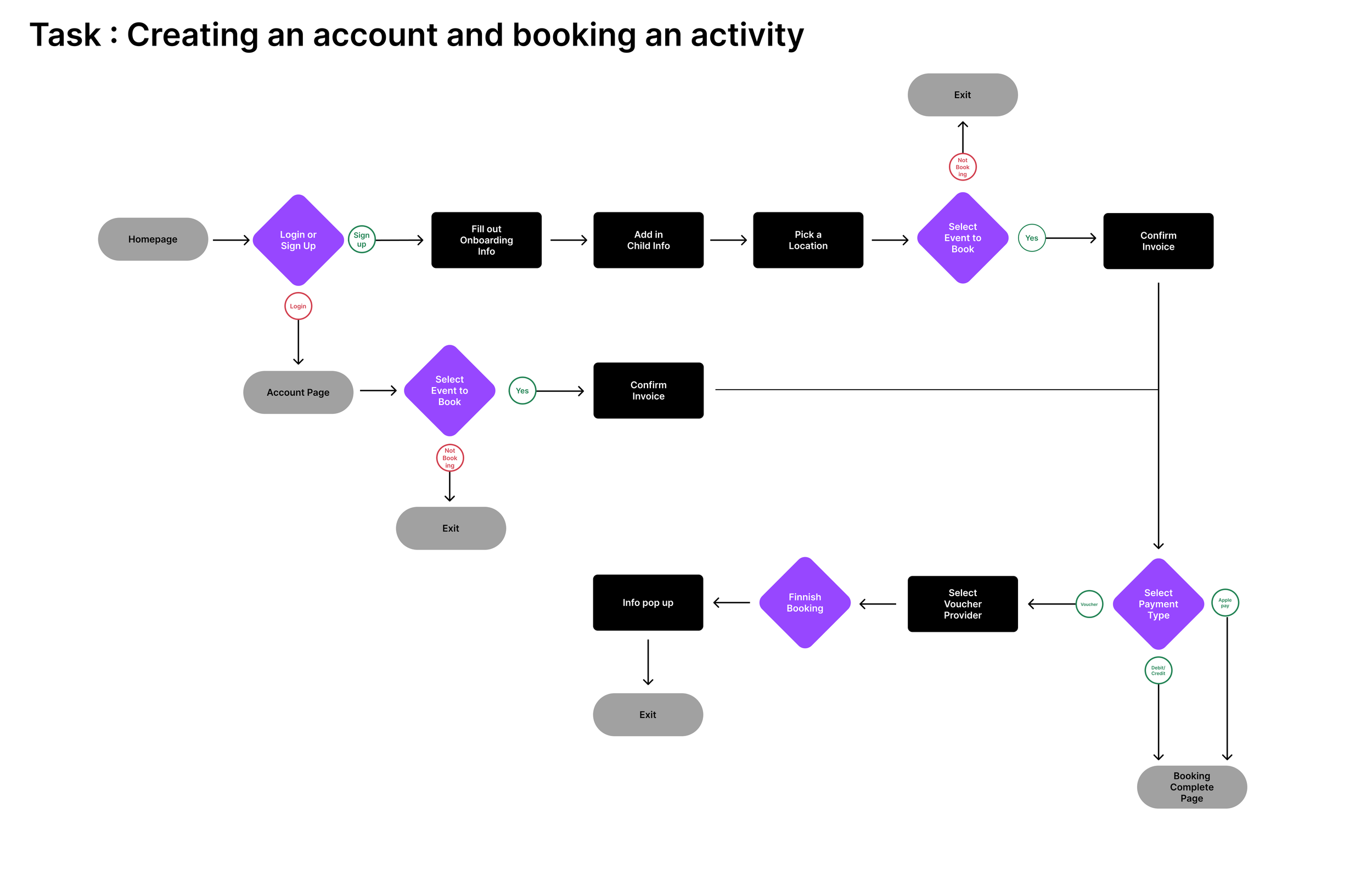
User Flows
We started off by coming up with the ideal path we wanted customers to take when signing up for an account and booking an event
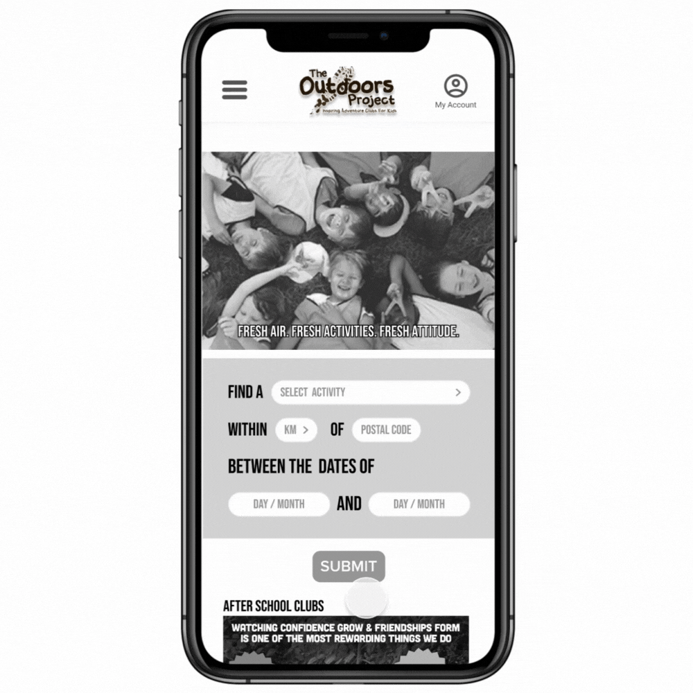
Wireframe
After prototyping the wireframe, we conducted five user tests with our wireframe to validate our solution. After our results, we connected with engineering to determine if this was a valid solution.
The engineering team scarped the first iteration of the plan. Several key features that were designed could not be created within the current system.
It turned out we'd given too much credit to the voucher care providers, who completed their payments at varying or unpredictable, times, and thus made our plan for a new voucher payment process impossible.

The voucher care providers are third-party government entities who complete their payments at varying or unpredictable times, and thus made, our plan for a new voucher payment process impossible.
Instead of setting up the system to generate a code for an admin to verify payment and confirmation to secure a spot once verified. One of the key issues of the voucher system is that different voucher providers have different dispersant dates. In some cases, the disbursement date could happen well 30 days after date the reservation was for.


There were also limitations to the backend capabilities of the site, providing a status update on payments would mean hiring someone to keep track of the payments manually making this feature not feasible.
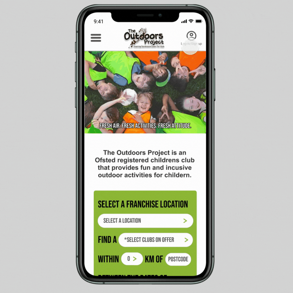
Some offerings are customized to each individual Franchise, such as birthday parties, so including that in our search results page wasn't going to work
High-fi #1
During our interviews with eight users, we had them go through the booking process on the current site and fill out a survey about their experience, giving us something called a "sus score".
In the design world, the bare minimum number you want is a 65. As you can see, the current site did not meet that.
After testing our re-design, we had them fill out the same survey, only now, the mobile experience has a sus score of...99.38! And yes, that is out of 100.
While it’s evident that our redesign will provide a greatly improved experience for The Outdoors Project’s customers, a designer’s work is never done.
Even with a near-perfect score, your customers still had some improvements they wanted to see, which Sarah will walk us through now.


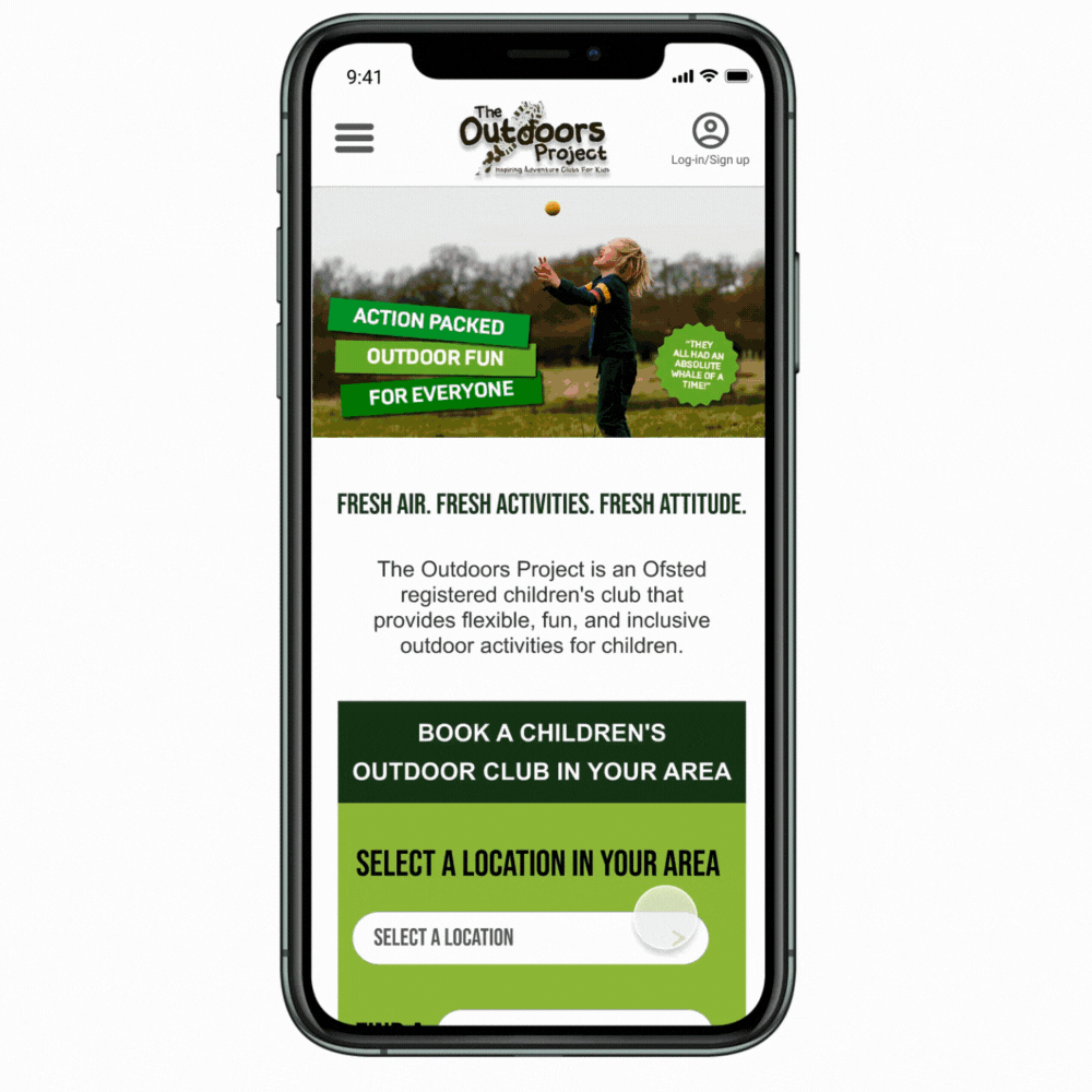
Of the 8 people who tested our design, 6 felt confused by the use of the word "franchise", perceiving it as referring to the business side and not themselves, the customers. So, we changed the phrasing to "SELECT YOUR PREFERRED CLUB" since that's what customers called it.
3 of 8 testers - which was actually 100% of the new users we tested - were confused by the purpose of the search box and expressed needing clearer direction regarding what to do. Thus, we added BACK the call to action sentence from the original site BUT changed the font and background color to make it easier to see and read. Thus, we added BACK the call to action sentence from the original site BUT changed the font and background color to make it easier to see and read. So, we listened and removed it from the search box.

Finally, 5 of our 8 users thought the NAVIGATION from the "MY ACCOUNT" page to SEARCHING for ACTIVITIES could be improved...
So we moved the button for this from the bottom to the top of the page AND made it a different COLOR to VISUALLY give it PRIORITY over the other buttons on the page. Now, it also matches the call to action on the search box you just saw, which we did intentionally to prime the user to pay attention to that color.
High Fidelity
This was the final iteration of the new outdoors project prototype. I created this to work on the insights gained from the last user test in the first iteration.
Next Steps
There was a three-week timeline for this project. For the next step, I would like to conduct more user testing with this iteration to see if the changes improved the usability score. I would also like to build out more of the screens for the project.